REVERY.AI (Y Combinator S21)
SaaS portal - build your own virtual dressing room.Revery.AI is a SaaS company that provides scalable virtual try-on technology for fashion retailers. I spearheaded a complete overhaul of their self service portal. Faced with a critical business pivot pre-launch, I had to pivot design quickly for a proof-of-concept with Saks Fifth Avenue where it contributed to a $1M+ contract with them and our successful expansion into the enterprise market.
Role
Product designer
Team
CEO, PM, 1 Engineer, 1 Designer (myself)
Duration
4 months
(Sept 21- Jan 22)
Problem statement
How might we simplify virtual dressing room (VDR) integration for individual sellers?
Revery.ai proprietary technology uses computer vision to realistically visualize mannequin photos on AI-generated models, allowing online shoppers to try on clothes virtually. This increases consumer purchasing confidence and reduce returns for retailers.

Spoilers ︎
grade Used for POC, contributed to $1M+ contract with Saks Fifth Avenue.
person_add 87% decrease in support tickets, 26% increase in user acquisition.
campaign Used for pilot with Neiman Marcus and Zalora integration (5M+ users)
Solution
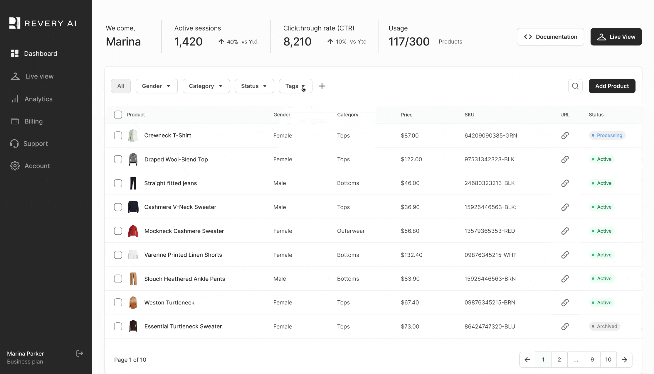
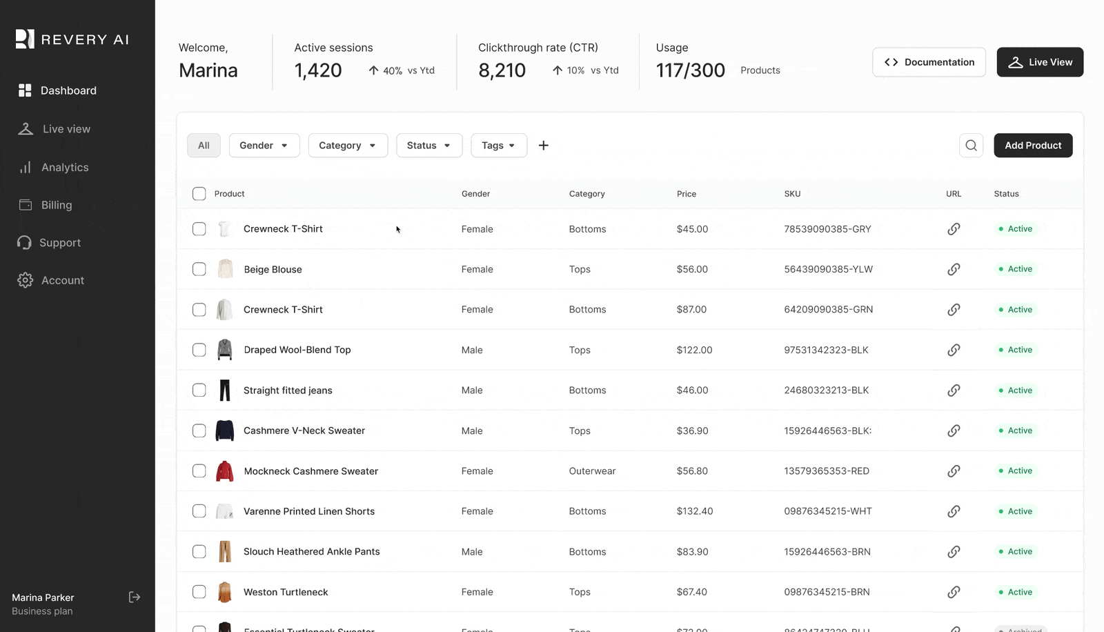
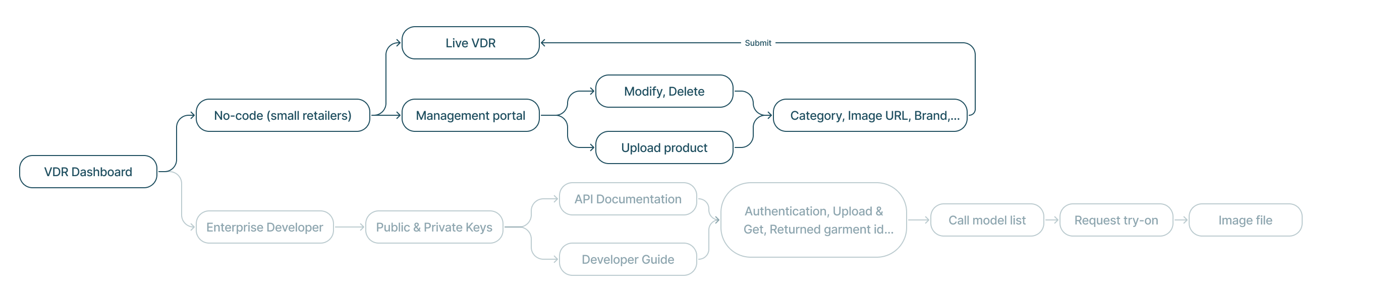
Self-Service Dashboard
The self-serve portal facilitates the integration of virtual dressing rooms onto ecommerce sites, providing inventory management, analytics tracking, and a live UI. Additionally, it offers API documentation for enterprise developers to manage large product volumes.
 Before
 After
After
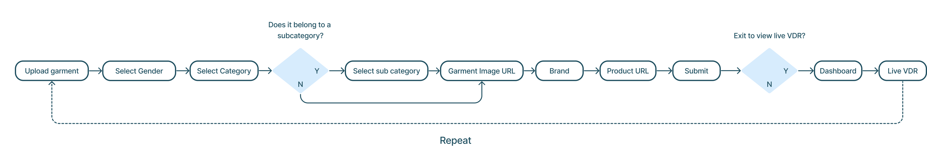
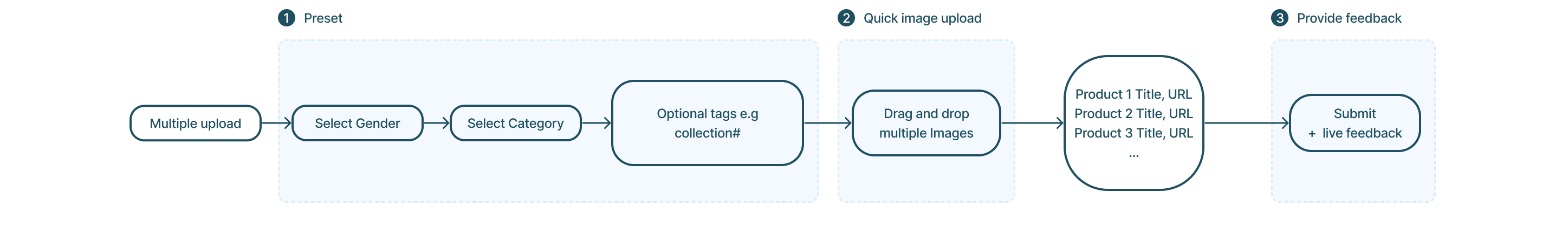
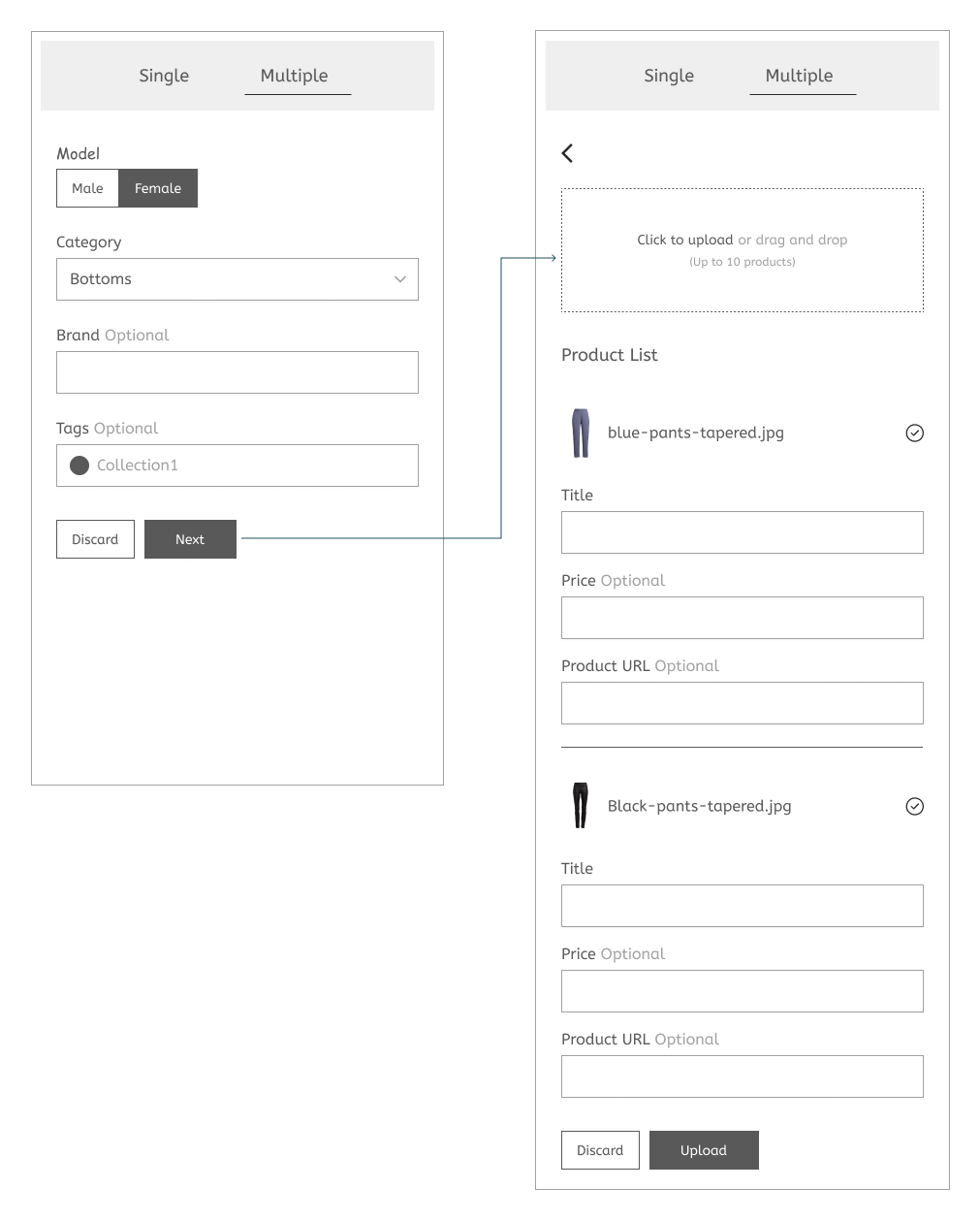
1. Upload multiple garments
The original dashboard requires users to upload their garments one by one, which is time consuming. I introduced a multiple upload feature to allow users to upload 10 garments at a time.

Before
 After
After2. Inventory management
Feedback that garments have been successfully uploaded is important. The sliding panel was designed to allow users to quickly view the status of their uploads without having to exit the page.
Before
After
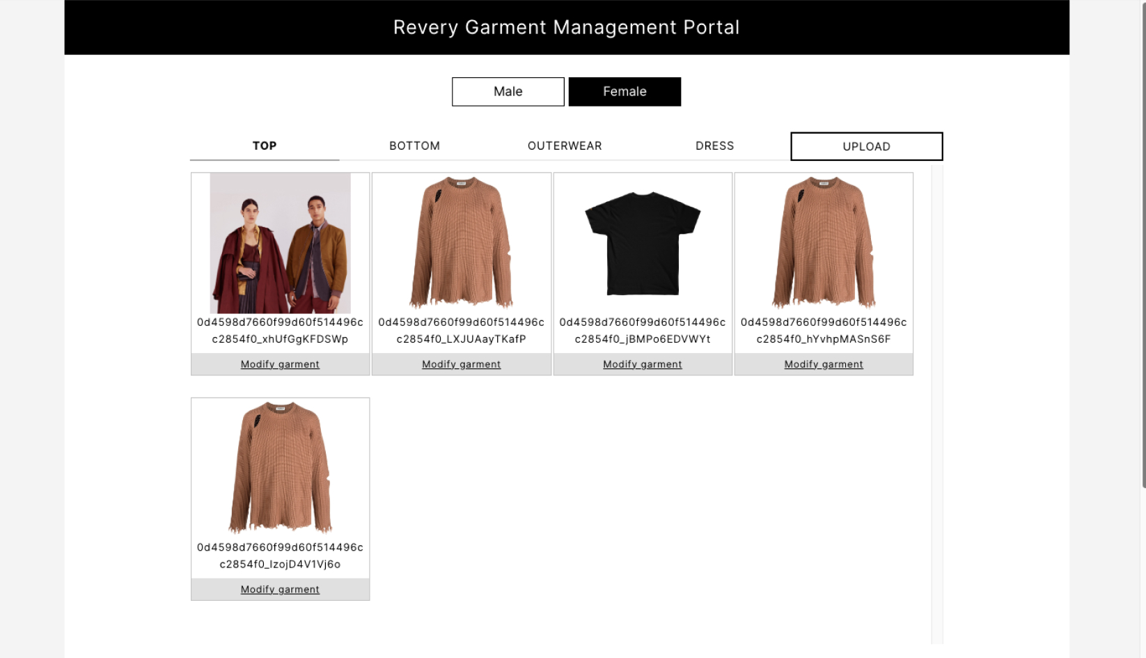
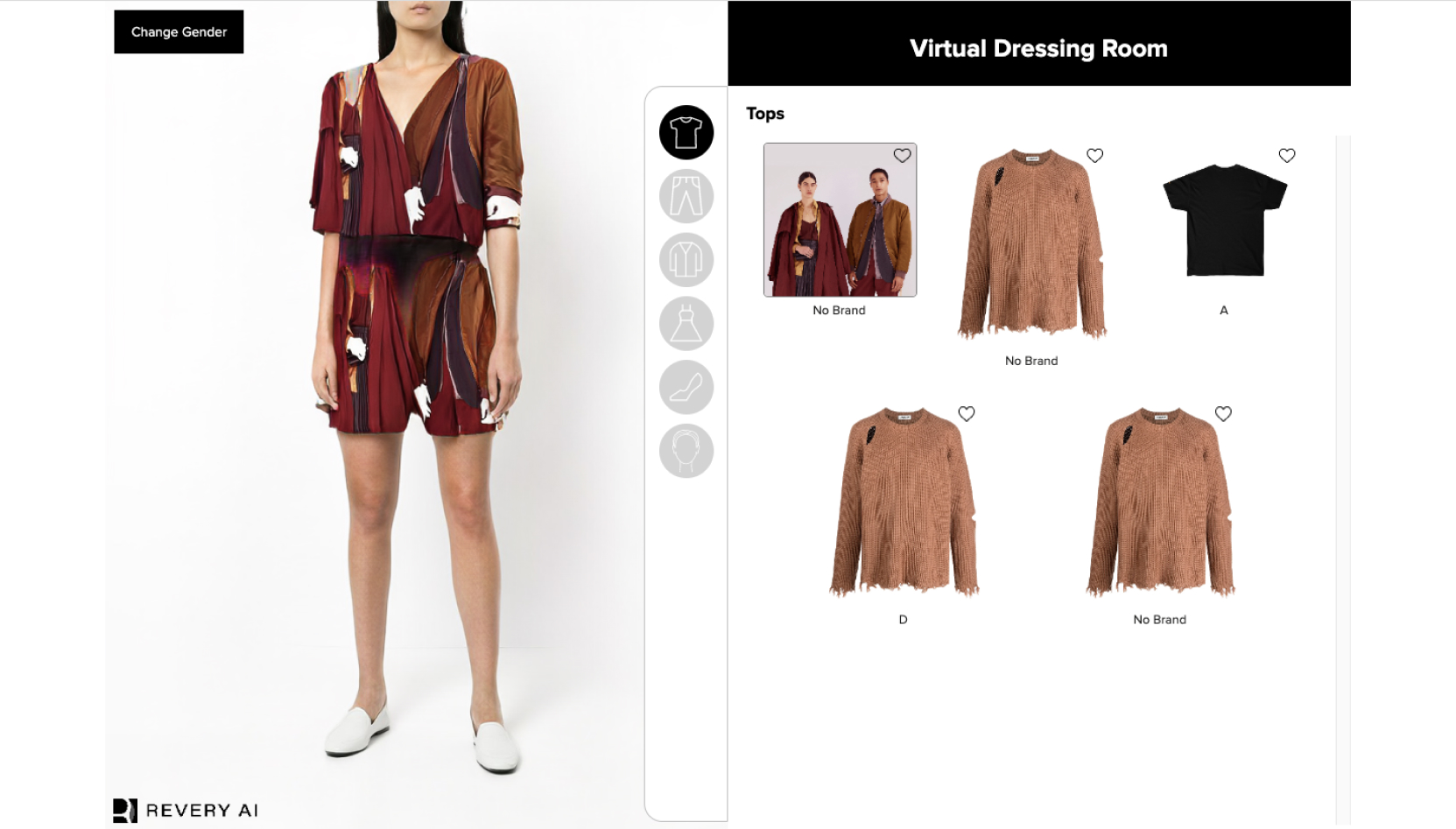
3. Live Dressing Room
Users no longer need to scroll through the dressing room to visualize a specific garment as a preview button has been added for direct viewing.
Before
After
Demo
Process
I worked in a trifecta consisting of the CTO, an engineer and myself, a designer. Together, we collaborated to make decisions that balanced technical requirements and UX. It also allowed me to adapt quickly to a major business pivot (explained later on). My general process consisted of:
Design scope
1-1 with the CTO gave me a better understanding of the API portal which caters to both small business owners and enterprises. The original dashboard was visually split between both target groups with the intention to be convenient for both, but the design felt counterintuitive as
Emphasis on low fidelity prototypes and testing
I worked in a trifecta consisting of the CTO, an engineer and myself, a designer. Together, we collaborated to make decisions that balanced technical requirements and UX. It also allowed me to adapt quickly to a major business pivot (explained later on). My general process consisted of:
- Frequent user research (interviews and contextual inquiry).
- Mostly designed in low fidelity and fequent usability testing.
- Minimal refinements from high fidelity design to dev handoff.
Design scope
Our initial focus were small retailers
1-1 with the CTO gave me a better understanding of the API portal which caters to both small business owners and enterprises. The original dashboard was visually split between both target groups with the intention to be convenient for both, but the design felt counterintuitive as
- Enterprise developers faced with irrelevant single upload feature.
- Small retailers intimidated by technical details for developers.
I separated the information relevant to each group in my prototypes to ensure users get relevant information specific to their tasks.
5 interviews with users (retailers)
I conducted interviews with 2 existing users and 3 others who are new to our service. I wanted to understand their scale and operations of their ecommerce stores, as well as their receptivity to our technology.
[ Insights ︎]
Sellers are already experienced in ecommerce platforms and its processes.
Sellers have their own unique way of organizing product information.
Sellers skeptical of outcome of the virtual try-on visualization.
[ Design Principles ︎]
Familiar design and learnable functions to fit existing mental models.
Flexibility and variation in product information organization.
Feedback and visualizations to build users trust with the technology.
Feedback and visualizations to build users trust with the technology.
Low-fi prototype 1
Dashboard that is familar and specific to user needs
To ensure our dashboard meets retailers needs and cater to existing mental models of ecommerce sites, I prioritized four key information chunks based on user insights and discussed technical feasibility with the CTO:
- Upload product.
- Inventory list.
- Analytics for virtual try-on conversion.
- Preview live visualizations.
 ︎ Option 1: Excessive data visualization, sellers already monitor on other platforms.
︎ Option 2: Inventory list prioritized as the core function for editing and organization of products.

︎ Option 3: Live preview was not technically feasible, slowing down system feedback.

︎ Revised: Provide key statistics unique to our service such as CTRs and user sessions, inventory list as largest real estate and removed live view (ideas to tackle tech constraints further down)
Low-fi prototype 1
Single uploads are time consuming
Uploading one product at a time is time-consuming especially for large quantities. I learnt that our system was able to support bulk image uploads, yet the current user flow did not accommodate for it.
Single uploads:
Introduced multiple uploads
Through interviews, I learnt that sellers often upload numerous products from the same category or collection. I introduced the multiple upload feature to avoid the repetitive process of single uploads.
- Create presets (category/brands/tags)
- Upload up to 10 products
- Feedback in inventory.
Low-fi prototype 2
Inventory display and system feedback
After uploading, users can view uploads reflected in the inventory through a split screen view. However, a conventional list view lacked space to display necessary product details without using modals or detail pages. Since our product had minimal additional information, a dedicated detail page was deemed unnecessary, and using a modal window would disrupt the user's workflow.
- Introduced accordions to allow for greater information density
- Larger product image
- Host additional tags, and URL.

︎ Existing: Tables necessitates horizontal scrolling and additional detail pages.

︎ Accordions: Increased information density to host additional information and larger product image.
Low-fi prototype 3
Flexible categorization via tags
Our search system was not advanced enough to handle spelling variations, prompting users to use tags to organize their inventory. However, during prototype testing, users did not use the tag feature extensively, which could pose problems in locating products later on.
- Introduced an “untagged” filter, for organizing products at a later time.
- Explored various ways to seamlessly integrate “untagged” option in the filter function.

︎ 2-tiered dropdown: overwhelming and excessive especially if the users only have a few tags.
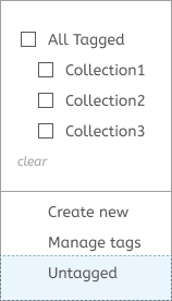
︎ Separated: confusing due to an incorrect hierarchy - did not belong with “manage” and “create”.
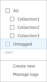
︎ Bottom-level: When users have many tags, they have to go through all the options and might miss it completely.
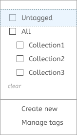
︎ Top-level: easily find and use it to organize products or content.

︎ Finalised Low-fi prototype 3